Does your mobile responsiveness suck? We all want our websites to wow visitors, but the truth is many business owners fail to recognize that just because their website is the bomb dignity on the computer, visitors that browse the part of the internet they call home from their mobile devices see a freakin’ disaster. I’ve got the secret code for finding out what your site looks like, on every single mobile device out there, and today I’m giving you the inside scoop!
The days of sitting down at the computer and writing out your grocery list while you wait for AOL to connect to your dial-up internet are gone, and more and more people are relying on their phones and tablets to browse the web. Which is great, because it means people have more opportunities to get online, but bad, because if the mobile responsiveness of your website is a disaster when people view it on their iPad at 2 AM, you’ve just lost yourself a client.

Not sure how your site measures up when it comes to its mobile game?
Get up close and personal (man, that was a good movie) and test your site’s mobile responsiveness with these quick tips:
If you’re a Mac user, this can be done in about .7 seconds by going to your website, and holding down ‘shift, command, c’.
Something like this will pop up:
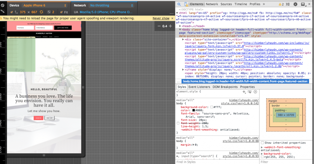
What the heck is all that junk on the right side? Leave it alone. The important thing is to view the images on the left because that is exactly what your audience is seeing when they view your page on mobile devices.
See up at the top, where it says ‘Device’? Click there, and you’ll get a super lengthy drop down box where you basically can see your website as it appears on every device ever.
Pretty sweet, huh?! Test different devices, and take notes about what you don’t like.
If you’re sitting at the PC table in the cafeteria, you don’t get a fancy secret code. Boo-hoo. While I didn’t find a similar command (believe me, I tried, by bothering my mom at work every five minutes asking her to try different combinations on her work computer- she’s such a peach!), but I did find this website, which is the next best thing.
Head here to type in your website, and you’ll see how it looks on other mobile devices.
Easy enough, right?!
If you’re horrified by what you find when you test the mobile responsiveness your site, here are some resources that will help:
11 Ways to Improve the Navigation on Your Mobile Site
Analysis: The Good, the Bad, and the Ugly of Mobile Retail Sites
3 Fast Ways to Speed Up Your Mobile Site
One thing to keep in mind is that the theme you have installed may play into the way your site looks on mobile devices. My old website looked like a bit of a disaster on my phone, because of the theme. Now that I have a new site, I can view it on my iPhone without getting completely bummed out!
Were you surprised by the way your site looks on different devices? Shout out your website woes in the comments!


Latest posts by Kimberly Haydn (see all)
- Holiday Hacks + How to Have a Good Enough Christmas (and LOVE it) - December 5, 2018
- Increase Summer Sales with These Marketing Ideas! - July 4, 2018
- Seasons of Change: Navigating Building a Business while Raising Your Children - September 24, 2017